October 7, 2026
Landing Page or Website With Ads?
Should your ads send people to a dedicated, standalone landing page or a page on your website? It depends on your goal.

Both of them live online, have a unique URL, are built with code (commonly a mixture of HTML and JavaScript with CSS to control the look and feel) and they can be made to look similar by applying your brand styles.
The key difference is that a landing page is just a single page, that is totally separate from your main website with no navigation menu leading elsewhere. It is typically only accessible by someone with the link. A website page, as the name suggests, exists within your main website, nested somewhere among all the other pages, and can usually be accessed via the navigation menu, or a hyperlink from another page, meaning it can be found by people who don’t have the link.
Given the obvious similarities, let’s contrast them by comparing pros and cons.
Pros:
Cons:
Pros:
Cons:
The deciding factor is your goal, because this then defines the purpose of the page.
If you’re running digital ads, whether these are on search engines or social media, you should already have a solid idea of what you’re trying to achieve, mapped to the various stages of your customer / supporter journey and the typical three stage marketing funnel.
👍 As a quick rule of thumb: choose a landing page where your advertising goal is a conversion action of any kind; use a page on your website for everything else.
When your focus is on just letting people know who you are and what you do, your website is the best destination for this: think Homepage, About Us, and Service or Product explainers. This is what we call 'top of funnel' content.
For those people who already know about you, and are doing a deeper dive to satisfy themselves you can be trusted, your website is best for this too because it provides what we call 'credibility scaffolding' - the content that shows-off your bona fides. For this, think: testimonials, FAQ pages, blogs, and case studies in particular. This is your 'middle of funnel' content.
When you're ready to try and get your aware audience to take action once they're happy they can trust you, it's time to bring out the dedicated landing pages. Free of all other distractions, you want people to focus entirely on the reason they are there, essentally giving them a binary choice: "take this action or leave", it's that simple. At this stage, you no longer want them wandering off and roaming around your website, you want them to either take the specified action or not. Use landing pages for: enquiry forms, gated downloads (like product specifications, pricing guides, detailed explainers etc), product sales, event registrations, and, if you're a charity, support requests and donations.
Take a look at this page on our website and this dedicated landing page which relates to the same service.
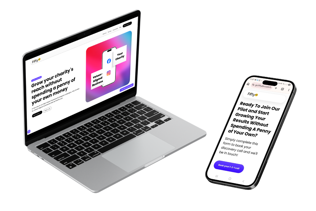
We don't use ads to send people to the website version, that's there for those who find it when navigating the site. We use the landing page, hosted on a subdomain, because it's cleaner, has fewer distractions, and has a single focus: getting people to book a discovery call.
When you're running top- and middle-of-funnel ad campaigns that send visitors to your website, you can just point them to the relevant section or page on your website and leave them to it (within reason). But when you are using ads to secure conversions on a landing page, it's different. Here's a quick guide to help you:
Found this blog useful and informative? Know someone else who could benefit from its wisdom? Then share it and show it some love on social media! Want expert, hands-on help building ad campaigns and landing pages? Give us a shout 👉 here.
Our latest news and trending topics